In fact, for retail signs Singapore in busy shopping areas, eye-catching and vibrant colours are particularly useful, and whatever you choose will influence how your customers view your brand. Here are some suggestions to consider for your shop signage colours.
Bold Colours That Draw Attention

These colours are often used in signboard design Singapore because they remain visible even from far away. When combined with 3D box up signage, bold colours become even stronger and help your sign make a powerful first impression.
Colour Contrast for Better Visibility

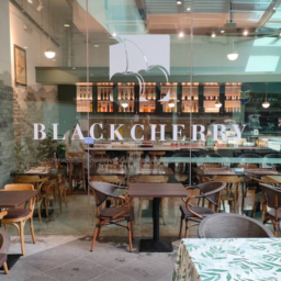
Soft Tones for Modern Branding
Some brands prefer soft pastel or neutral tones for a clean and stylish visual effect. These tones match well with lightbox signage that brings a warm and modern feel. Simple designs created with basic signage also look neat with soft colours.
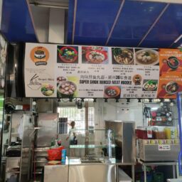
Effective Colours for F&B Stores

Many restaurants and cafés use these colours on their food signage to draw in diners. For a more lively appearance at night, brands often choose neon signage to give their storefront a bright and stylish glow.
Colours Around the Entrance Area
Your branding colours may also be reflected on pillars or walls around the entrance area. A pillar wrap helps customers to easily find your shop when walkways are crowded.